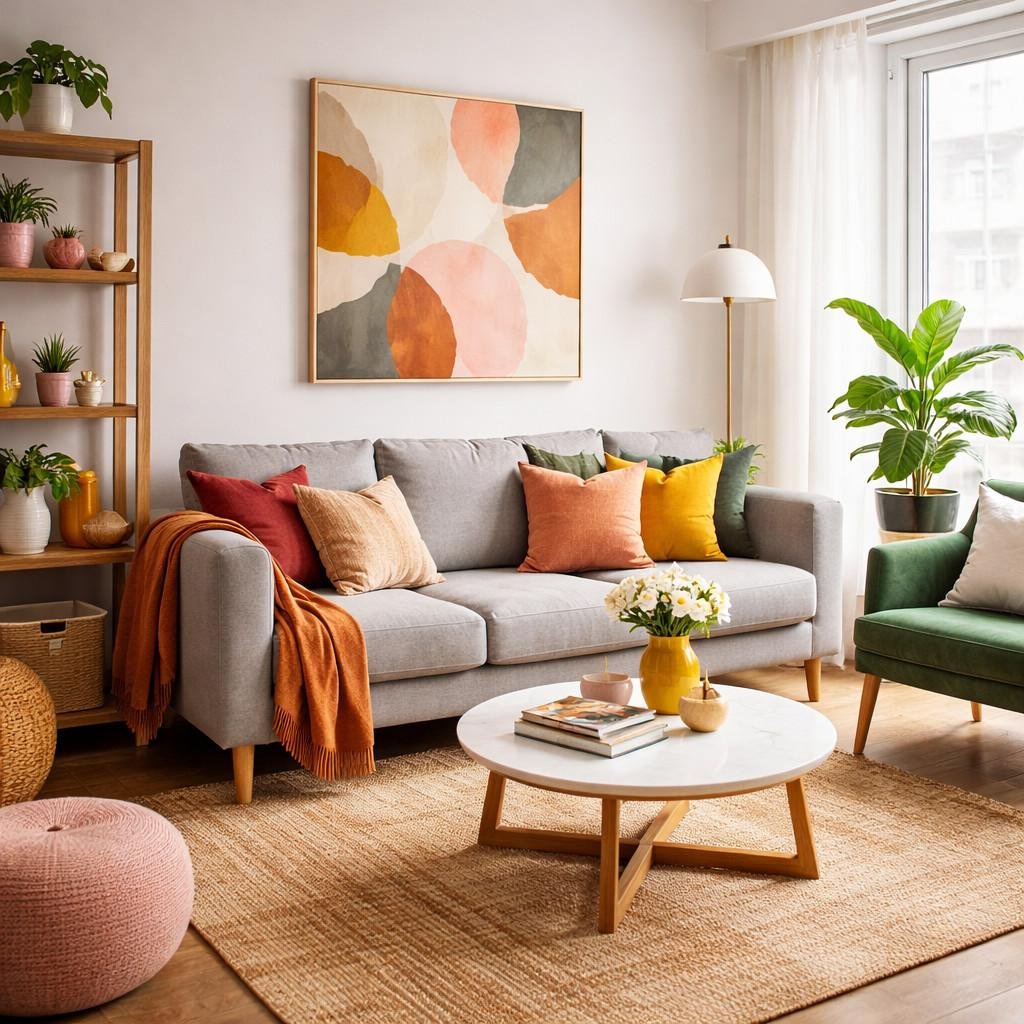
You desire a colorful living room but definitely not one that reminds you of a crayon box that is bursting out of the middle of your house. Okay, that’s fair enough.
I made the same mistake before and paired mustard yellow, teal and hot pink in the same space since I was feeling bold. But what happened was that the room felt bold too… and I mean aggressively bold. This was a first hand lesson to me.
And now it is time to get to business and discuss some colorful living room ideas, which really feel stylish and balanced. Color is not something that you should fear using and that will overwhelm your space. It only needs some organization and some patience.
So if you’re ready, let’s do it together.
Table of Contents
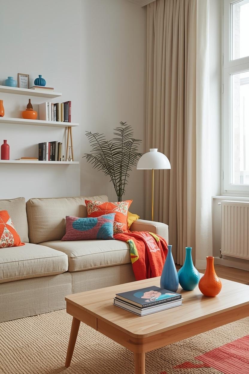
1. Use the 3-Color Rule (It Saves You Every Time)
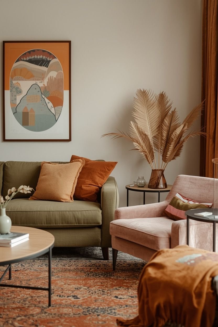
Stick to three main colors, that is one thing that you should remember about this article.
That’s it, just three not seven. Not “I found this cute pillow so now I have five accent colors.” Literally three.
How the 3-Color Rule Works
You break your colors into:
- 1 Base Color (usually neutral or soft)
- 1 Support Color (medium strength)
- 1 Accent Color (the bold pop)
This formula keeps your colorful living room from feeling chaotic.
❓ Ever walked into a room and felt instantly calm – even though it had color?
That room probably followed some version of this rule.
Real-Life Example
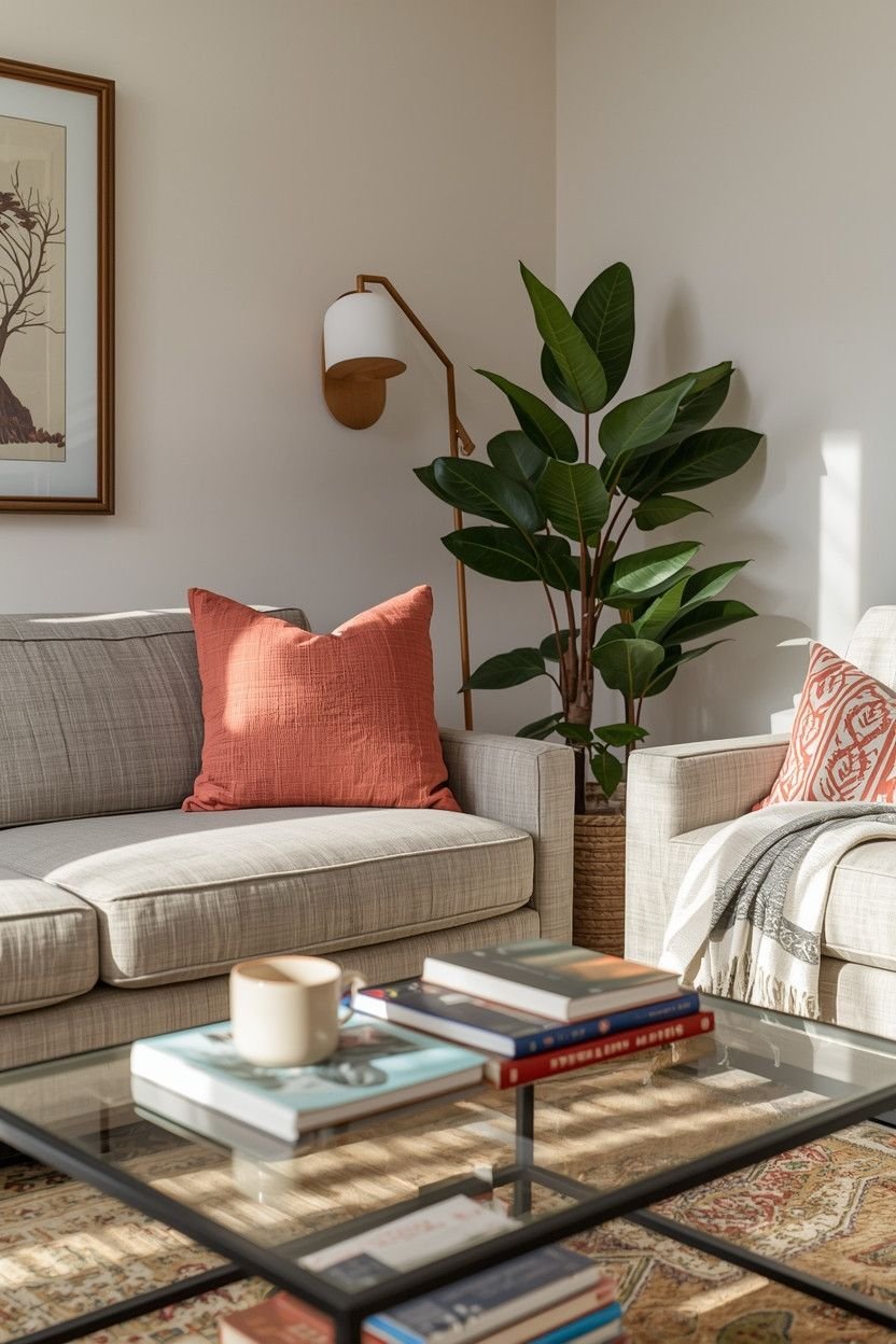
Let’s say you choose:
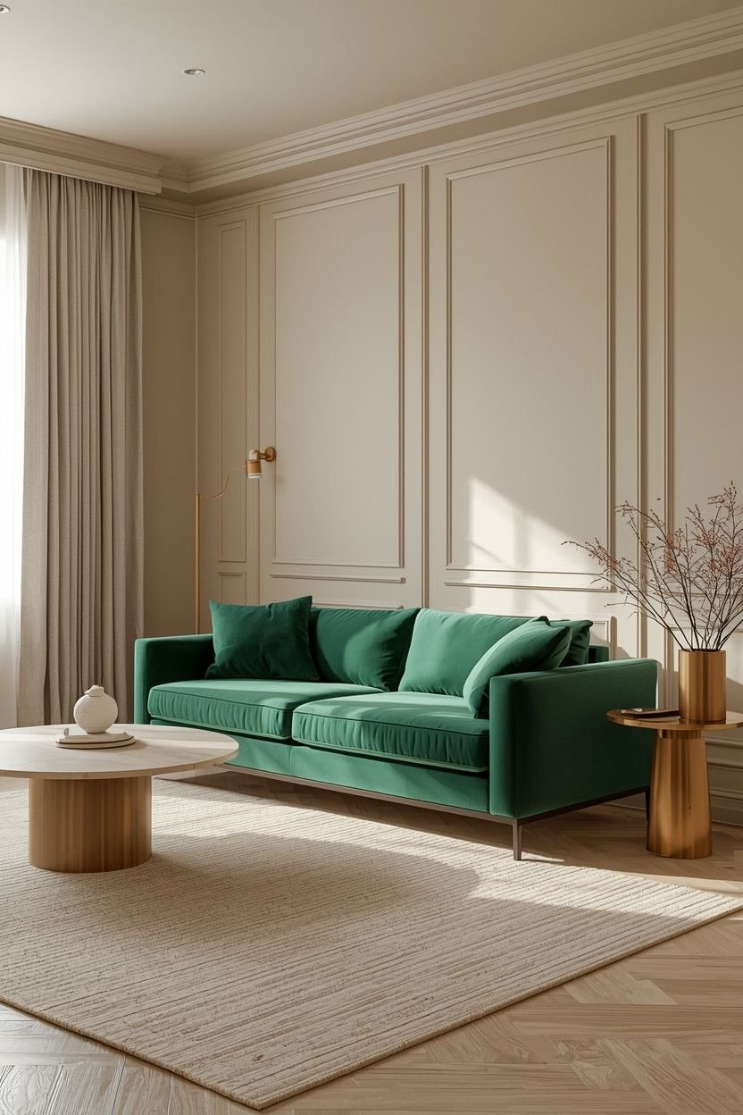
- Warm cream as your base
- Dusty blue as your support
- Burnt orange as your accent
Now your sofa, rug and walls stay calm. Your pillows, art and maybe one chair carry the stronger tones. See how that feels controlled instead of random?
💡 Tip: Repeat each color at least twice in the room. That repetition creates rhythm. Without repetition, color looks accidental.
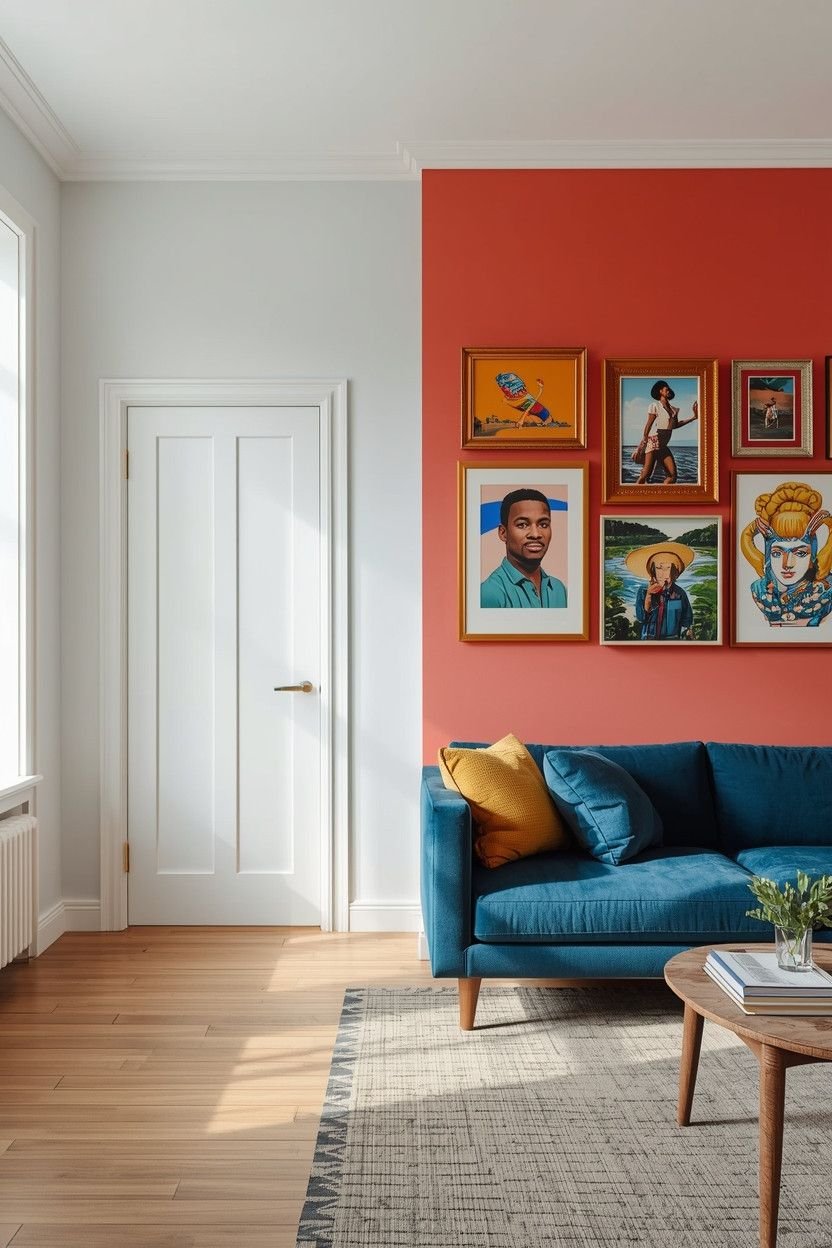
2. Add One Bold Anchor Piece
Want color but fear commitment? Well, I get it.
Paint feels permanent so instead try this: add one bold anchor piece and keep the rest balanced.
This idea works like magic in small and medium spaces.
What Counts as a Bold Anchor?
Pick One:
- A colorful velvet sofa
- A bright patterned rug
- A bold accent wall
- Oversized artwork with strong color
That is your hero and everything else will support it.
Why This Works
When you choose one strong focal point, your eyes know where to land and your brain relaxes so the space feels intentional.
❓ Have you ever had that experience of having colorful living room ideas that seem “too much” but you can never explain why? In most cases, there are too many elements competing to get noticed.
💬 IMO, one bold sofa beats five loud accessories every time.
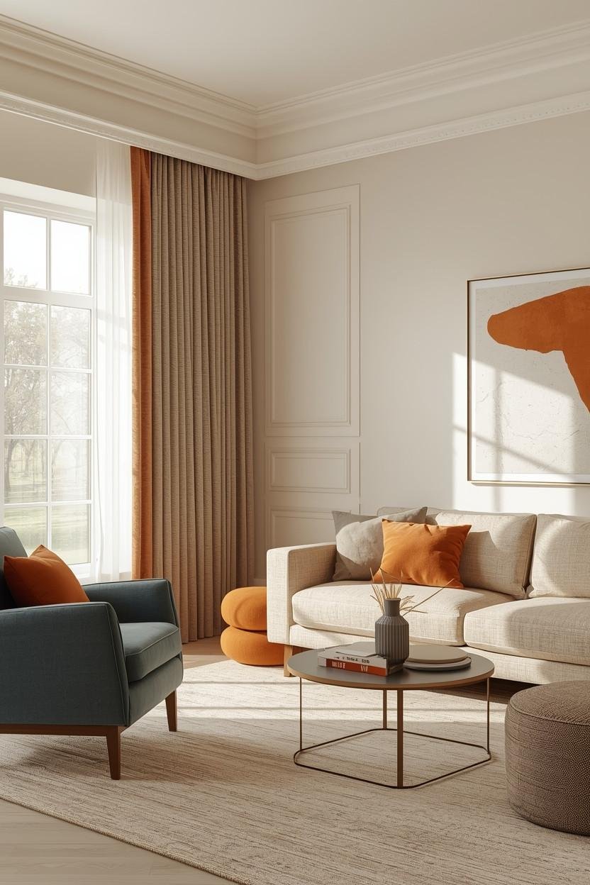
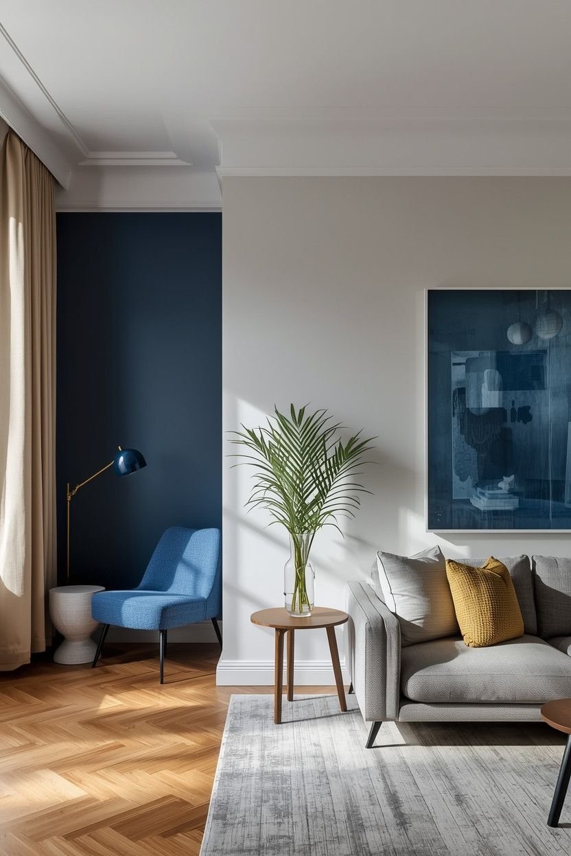
3. Warm and Cool Balance Makes All the Difference
Would you like to talk about temperature? I don’t mean thermostat temperature, but color temperature.
You probably already use warm and cool tones without thinking about it. But when you mix them intentionally, your living room instantly looks more designer-level.
Quick Breakdown
- Warm colors: terracotta, mustard, coral, warm wood
- Cool colors: blue, sage, charcoal, soft grey
When you are applying warm colors only, you can make your space heavy. If you use only cool tones, it can feel flat.
The Balance Trick
Pair one warm tone with one cool tone and keep one neutral to tie them together.
Example:
- Cool sage walls
- Warm leather chair
- Cream rug
Suddenly the space feels layered and balanced. Not overwhelming, just… right.
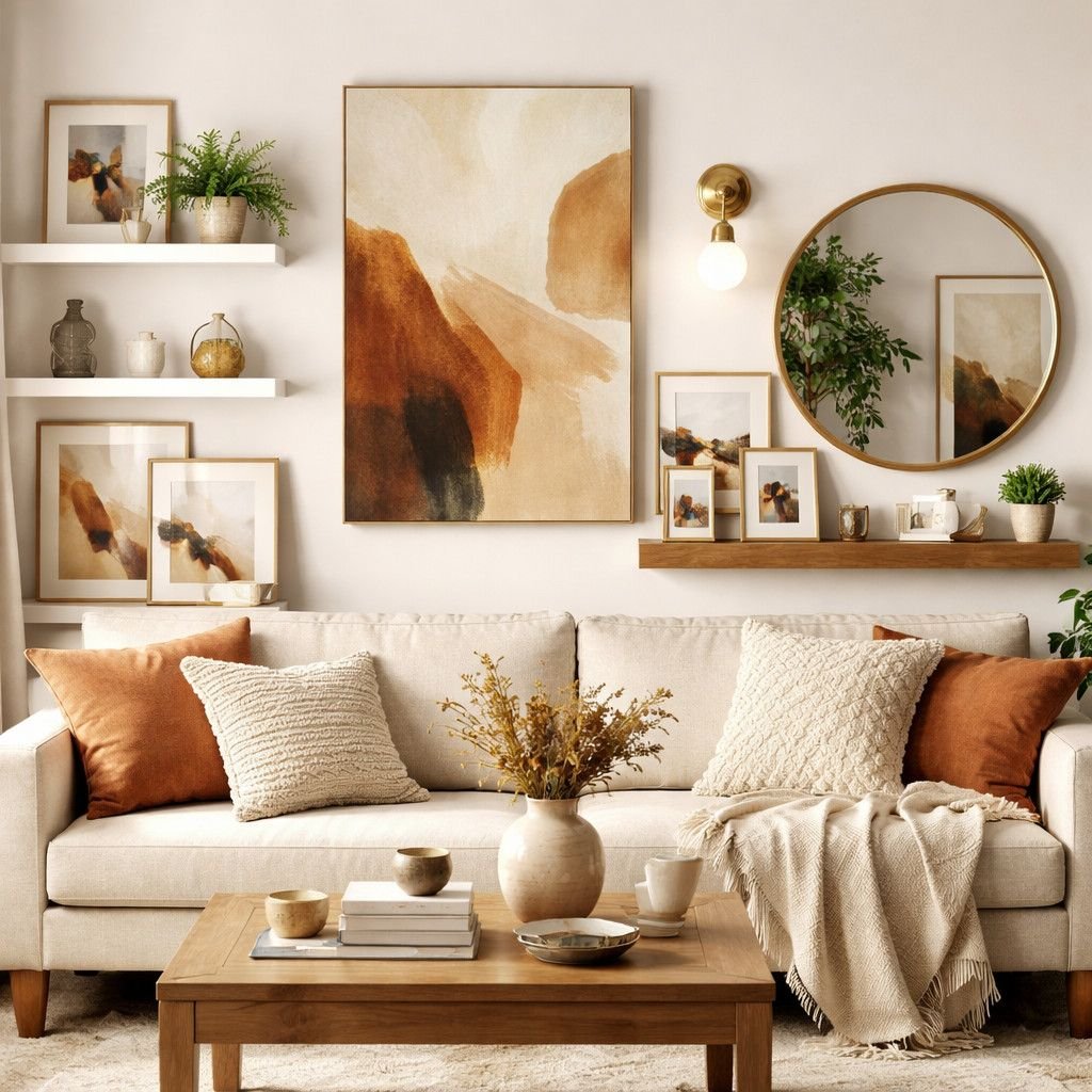
4. Keep the Base Neutral and Let Accessories Do the Talking
To have a colorful living room, you do not have to have neon walls. The best thing is sometimes the easiest thing to do.
Keep your big surfaces neutral:
- Walls
- Sofa
- Large furniture
Then let color shine through:
- Pillows
- Throws
- Art
- Vases
- Books
Why This Approach Works So Well
Neutrals create breathing room so color pops against calm backgrounds.
You would not put bold lipstick and bright blush and glitter eyeshadow all together (unless you want to be chaotic and TBH, no judgment here). Living rooms are no exception to the rule.
💭 The calm foundation ensures that bold accents appear purposeful rather than loud.
By the way, this technique is particularly effective in small living rooms where excess color tends to make the space look even smaller.
5. Create Color Zones Instead of Color Chaos
This one changes everything because instead of spreading color randomly throughout the room, group it into zones.
What Is a Color Zone?
Color zone refers to the fact that you concentrate color in one area instead of dispersing it everywhere.
For Example:
- A reading corner with blue chair + blue art + blue throw
- A coffee table zone with terracotta decor + matching candles
- A gallery wall with a unified palette
Grouping colors together makes them feel purposeful.
Why This Feels Stylish
When you scatter colorful decor evenly, your room feels busy. When you group colors thoughtfully, your room feels curated.
❓ Ever noticed how stores style their displays? They cluster colors and don’t sprinkle them randomly.
You can totally steal that trick from them.
6. Use Muted Versions of Bold Colors
You do not need to be all neon to make an impression.
Bright red → rust.
Electric blue → dusty teal.
Lime green → olive.
See what’s happening? You still get color, but it feels grounded.
Why Muted Tones Feel Stylish
Muted colors have a slight grey or brown in them, and this dilutes the intensity. That softness makes your living room feel cozy instead of loud.
❓ Have you ever noticed that high-end interiors rarely use super-saturated colors straight from the paint chip? They tone things down just a little and you can do the same.
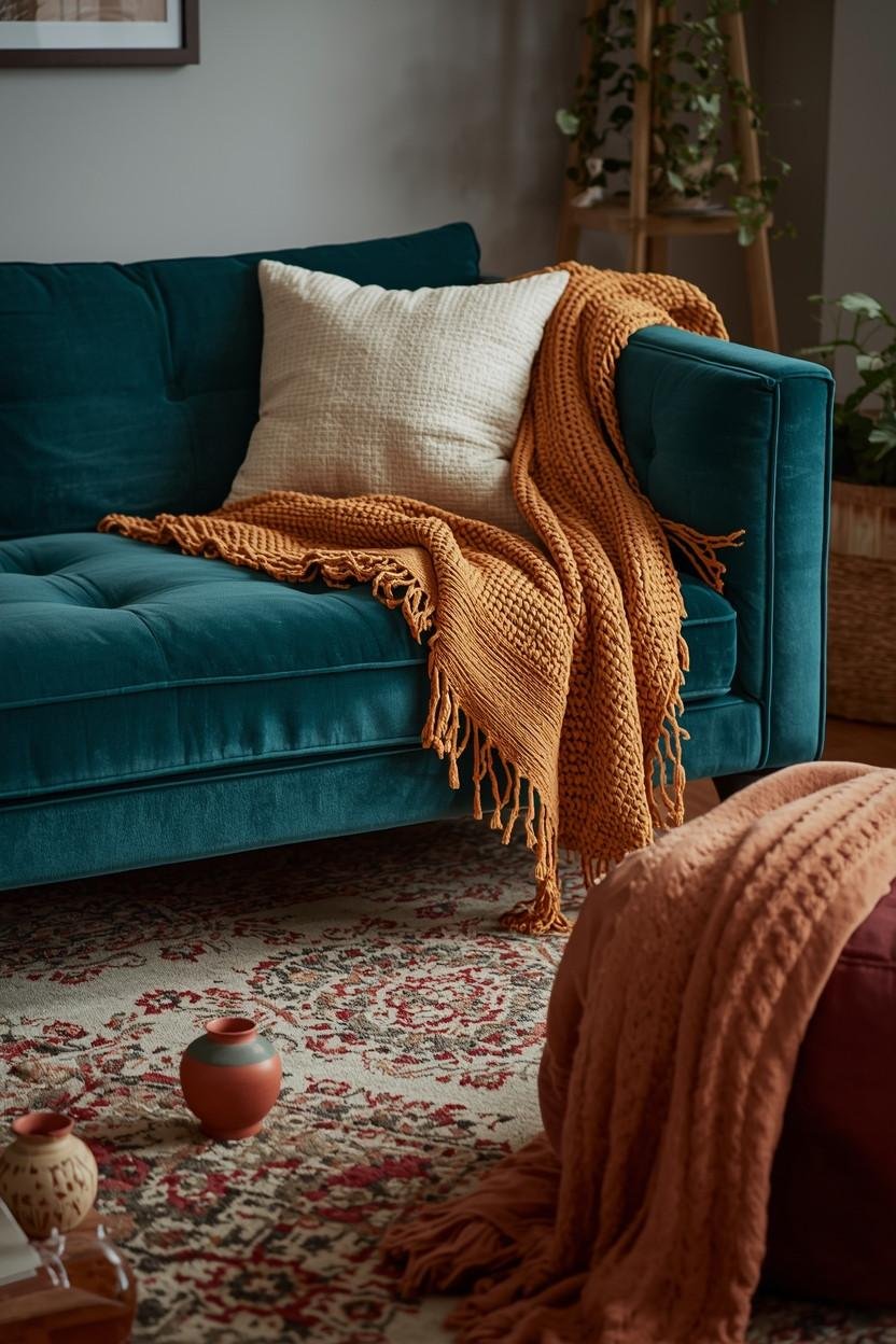
7. Layer Color Through Texture, Not Just Paint
People think “colorful living room” equals painted walls but that is not always the case.
You can layer color through:
- Velvet cushions
- Woven throws
- Patterned rugs
- Ceramic decor
- Art prints
When you introduce color through texture, the space feels richer without feeling chaotic.
A teal velvet pillow feels more calming than a teal painted wall and that’s because the texture absorbs the intensity. Pretty cool trick, right?
8. Try a Colorful Ceiling Instead of Bold Walls
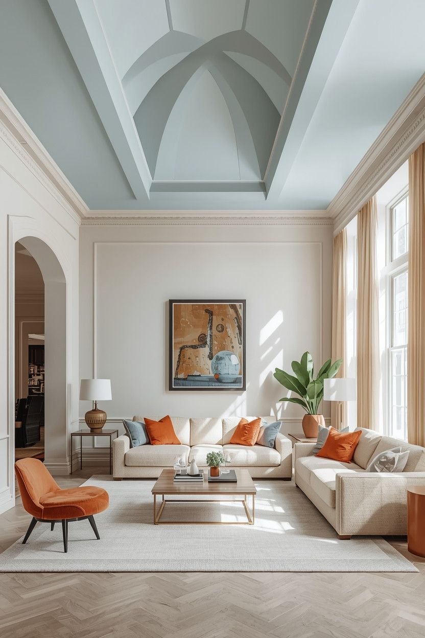
Okay, this one is worth listening closely.
To have something unexpected yet something you have control over, paint the ceiling rather than the walls.
Keep walls neutral and add a soft pastel blue, sage or blush ceiling. The room suddenly feels creative without overwhelming your eyes.
Why Does this Work So Well?
Because your furniture stays calm and the color sits above you that adds a personality without competing with everything else.
🤔 Would you try it? Or does that feel slightly terrifying?
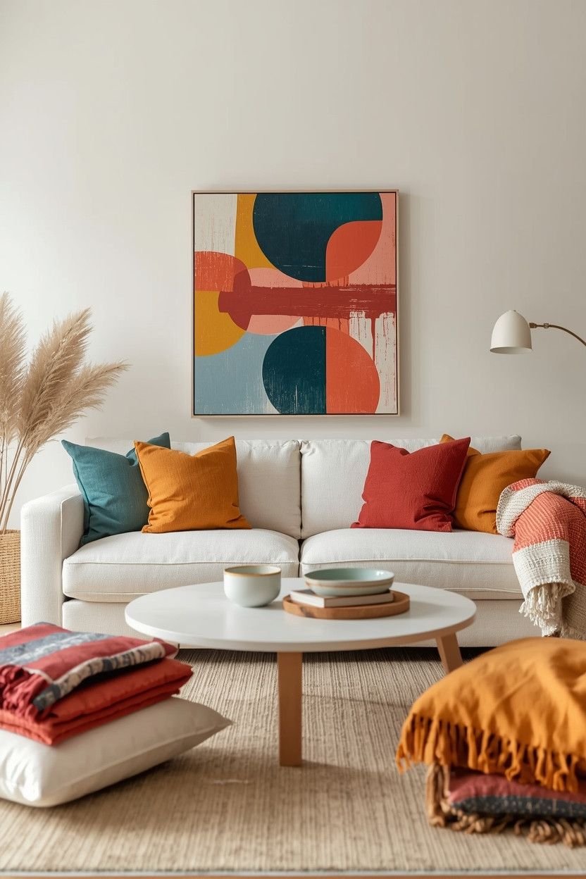
9. Use Artwork as Your Color Guide
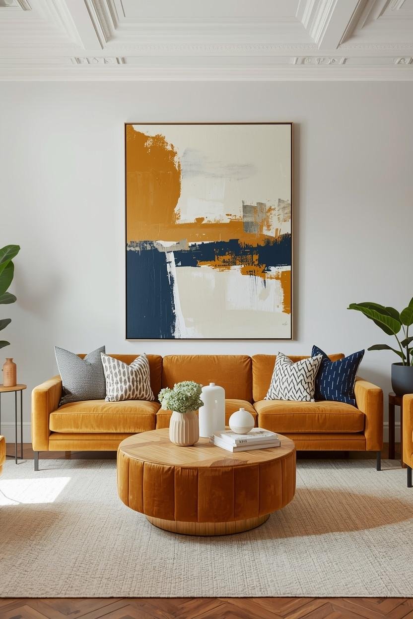
Here is a super simple strategy you can follow that is to let your art choose your palette.
Pick one large piece of artwork you love and then pull 2-3 colors from it and repeat them around the room.
For Example:
- Blue from the painting → throw pillows
- Mustard from the painting → vase
- Neutral background → rug
This method feels cohesive because it literally starts from one source.
In my opinion, this is among the safest methods of building a colorful living room without thinking over everything.
10. Keep Furniture Neutral, Go Wild with Small Decor
If you’re nervous about big commitments, then why not take on smaller ones?
Choose:
- Neutral sofa
- Neutral rug
- Neutral coffee table
Then Have Fun With:
- Bold lamps
- Colorful books
- Bright trays
- Patterned cushions
Small decor pieces feel low-risk as you can swap them anytime without any stress.
❓ Ever bought a colorful chair and regretted it later? Exactly, accessories forgive you but furniture does not.
11. Create a Two-Color Theme for a Clean Look
In case three colors are too much, use only two primary colors and a neutral.
Example Combos:
- Navy + mustard + cream
- Blush + olive + beige
- Teal + terracotta + white
Limiting yourself forces discipline and we all know that discipline creates style.
A tight palette always feels intentional but random color additions feel… accidental.
So ask yourself: do you want curated or chaotic?
12. Use Plants to Soften Bold Colors
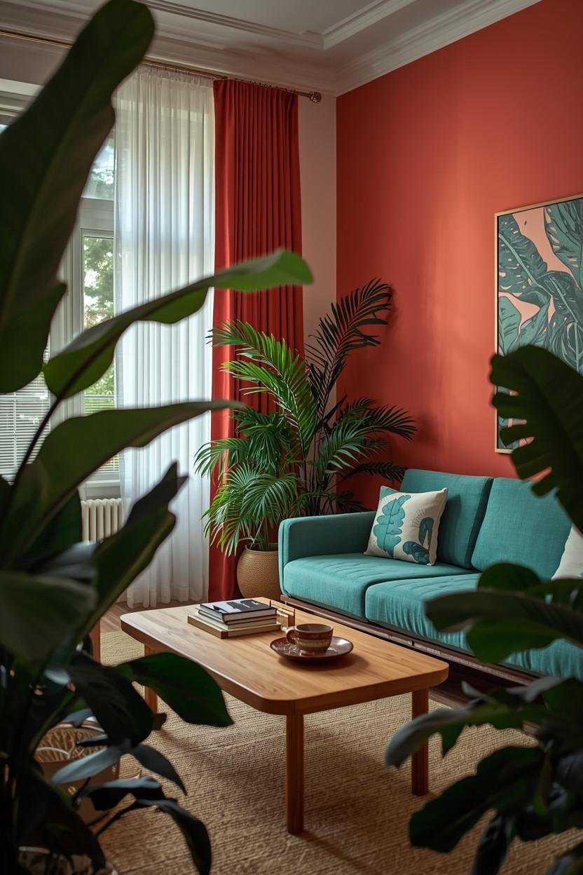
Green plants count as color and they save rooms.
If your living room feels slightly too bold, add:
- Large leafy plants
- Small potted greenery
- Hanging vines
Green acts as a natural neutral while balancing warm and cool tones without clashing.
❓ Why do bold rooms with plants always feel better? Because nature never fights the palette instead it blends.
Plus, plants make everything look more expensive. That is just another bonus 🙂
13. Keep One “Quiet Wall” for Visual Rest
This idea sounds simple, but most people ignore it all the time.
If you add color to three walls, leave one wall calm. If you create a bold gallery wall, keep the opposite wall minimal.
Your eyes must have a place of rest.
The room is overwhelming when all the walls are screaming to be heard. When one area stays quiet, the room breathes.
Balance matters more than brightness.
14. Use Color in Layers Instead of All at Once
You don’t need to introduce every color in one weekend so start small.
Add a few pillows and stick with them for a week. Then add a throw then maybe later, change the artwork.
Gradual color layering will give you the idea of what really works in the space.
❓ Have you ever purchased five colorful items simultaneously, and then noticed that they do not communicate with each other? Yeah… it happens.
When you build color gradually, you stay in control and room evolves instead of exploding.
15. Let Wood and Natural Materials Break Up Bold Color
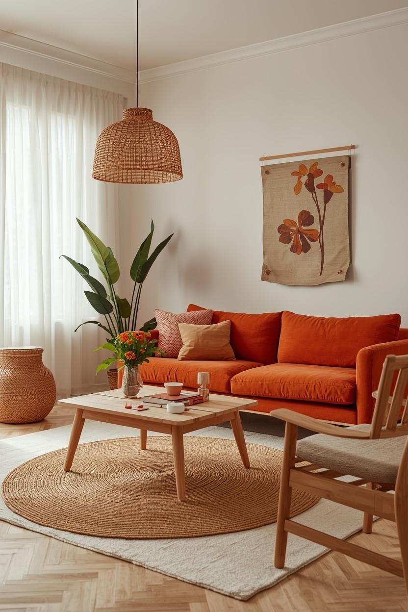
This is something people forget is that natural materials calm everything down.
If you add strong color, balance it with:
- Light oak furniture
- Rattan baskets
- Linen curtains
- Jute rugs
- Wooden coffee tables
Natural textures act like quiet mediators in a colorful room. They soften intensity without dulling your palette.
Colorful boho living rooms often feel relaxed instead of loud because they mix bold tones with earthy textures.
Bonus: How to Choose Colors Without Overthinking
Let’s be honest, we know that picking colors can feel overwhelming sometimes. So here’s a quick cheat sheet I use.
The Simple Selection Formula
- Pick one color you truly love.
- Find a softer version of it.
- Add one neutral that balances both.
That’s your palette.
You don’t need a degree in color theory, just clarity and a little confidence.
If you ever feel stuck, grab inspiration from:
- Artwork you already own
- A patterned rug
- Nature photos (seriously, nature never messes up palettes)
Common Mistakes That Make Color Feel Overwhelming
Let’s quickly avoid the traps, okay? Because honestly, most “overwhelming” colorful living rooms happen because of these small mistakes.
❌ Too Many Competing Patterns
When all the things are boldly patterned, you will not be able to figure out where to rest your eyes. Geometric prints, abstract art – all fighting for attention at the same time? That’s visual noise.
Rather, select one primary pattern or possibly two max and leave the rest minimal. Just imagine such patterns as strong personalities at a dinner party. One outspoken guest feels fun. Five? Just exhausting.
❌ Ignoring Scale
A tiny pop of bold color won’t carry the room. A huge block of neon might overpower it. Scale matters more than people realize.
When you select a bold shade, make it have some presence to make it purposeful. E.g. Repeat a color in a pillow, artwork and a vase.
Don’t let it sit alone looking confused. At the same time, don’t let one massive bright wall dominate everything unless the rest of the room feels calm and balanced.
❌ No Repetition
The first time you use a color and do not use it again, it seems to be an accident. Similar to how you purchased something on a whim and did not know where to store it.
The main colors have to be repeated at least two to three times around the space. That repetition connects the room visually.
💬 Ever notice how styled rooms always feel cohesive? Designers repeat colors on purpose. You can do the same.
❌ No Neutrals
Without neutral grounding, colorful living room ideas turn chaotic fast. Neutrals give your eyes a place to relax.
Think of white, beige, cream, soft grey or even natural wood tones as the “pause button” in your design. They make it all calm so that your colorful pieces do not compete with each other but can shine.
Comparing Two Approaches: Which Feels Better?
Let’s do a quick comparison between the bold and balanced stylish approach.
Overwhelming Approach
- Five strong colors
- Multiple busy patterns
- No neutral grounding
- Random placement
Result are loud, busy and lightly stressful :/
Balanced Stylish Approach
- Three main colors
- Clear focal point
- Warm & cool balance
- Neutral base
Result? Cohesive, confident, and stylish.
See the difference?
My Personal Go-To Combo (If You Want Inspiration)
I love:
- Soft cream base
- Muted teal support
- Rust accent
It feels comfortable yet modern and adds personality without screaming for attention.
Would I add neon green to that mix? Absolutely not. I respect my living room too much.
But that’s just me. Which colors can you say you are relaxed and happy with? That question matters more than trends.
How to Test Color Before You Commit
Scared of commitment? Same.
Try these before making permanent changes:
- Swap pillow covers first
- Use removable wallpaper
- Add art before painting walls
- Layer rugs instead of replacing flooring
Small changes help you experiment safely and honestly experimenting feels fun. Why rush into repainting everything?
Final Thoughts: You Can Do Color Without Chaos
Color does not equal clutter and bold does not mean overwhelming.
If You:
- Stick to three main colors
- Choose one bold anchor
- Balance warm & cool tones
- Use a neutral base
- Group colors intentionally
It will help you make your living room appear fancy, cozy and welcoming.
So, the next time you are browsing through colorful living room ideas and get inspired and a bit intimidated, keep this in mind: structure always beats randomness.
Color can only be useful when you drive it and not when it runs out of control.
Now tell me which color are you obsessed with at the moment? 😉