
Red and green every year on the tree, the garland, the pillows… until your living room starts looking like a festive traffic signal 😭
I did this for years and I’m not ashamed to admit it.
Then one holiday season I swapped the usual decor for a moody blue-and-gold palette and suddenly my living room looked intentionally designed instead of just “holiday decorated.”
So If you’ve been looking at the same red stockings and green garland thinking, “there has to be more than this” – there is. Here are 12 colorful Christmas decor Ideas for the living room that go way beyond the usual holiday look.
Table of Contents
1. Deep Blue and Gold – The Luxe Winter Look
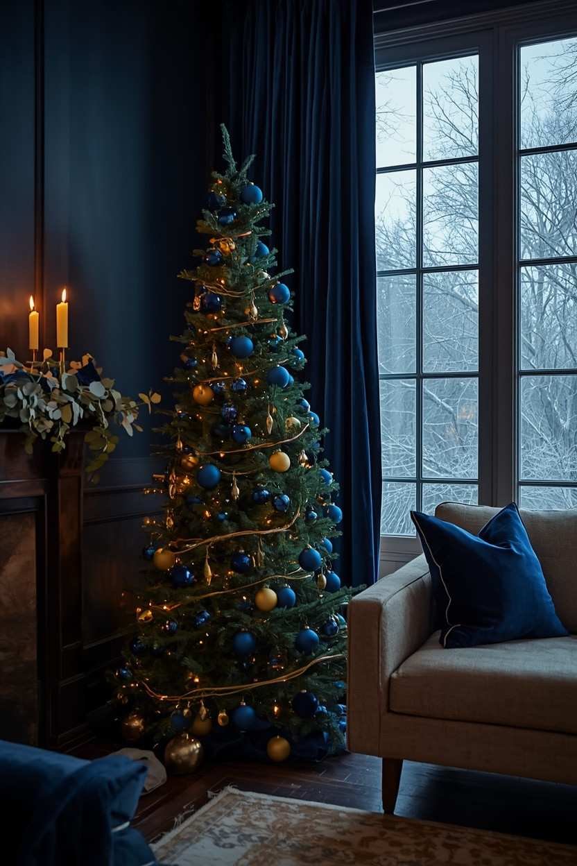
This is the palette that convinced me red and green weren’t mandatory.
Deep navy or sapphire blue paired with warm gold creates a Christmas living room that looks rich and genuinely festive without relying on a single Santa-red accent.
Think: navy velvet throw pillows, gold ornaments on the tree, brass candleholders on the mantel and deep blue ribbon woven through a silver eucalyptus wreath. It feels wintery and elegant at the same time
How to Pull it Off:
| 🎨 Styling Step | How to Do It |
|---|---|
| Start with Base | Build around existing navy or gold in your sofa, curtains or rugs |
| Choose Warm Gold | Use soft, warm gold (not bright yellow-gold) for candlesticks, frames or accents |
| Add Deep Blue Velvet | Introduce in small touches like ornaments, table runners or stockings |
| Stick to White Fairy Lights | Keep lighting clean and polished with warm white fairy lights (no colors) |
And honestly, this palette just works year-round – no need to tear your whole room apart just to make it feel like Christmas.
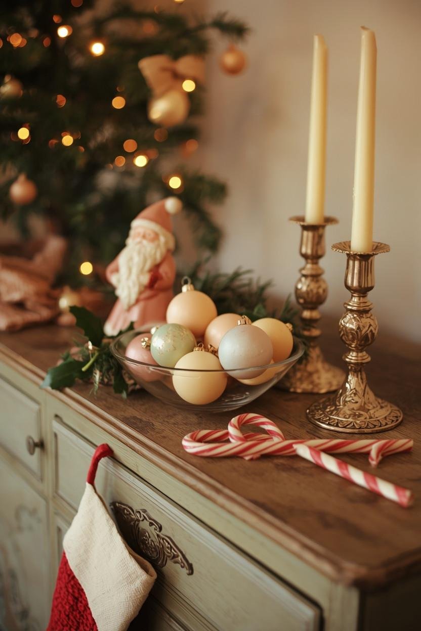
2. Blush Pink and Champagne for a Soft, Romantic Feel
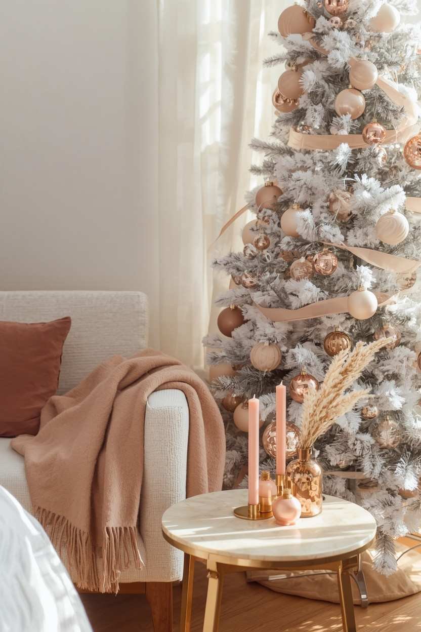
Pink Christmas decor has had a moment for a couple of years now and it is not going anywhere. In fact, designers have been pairing blush pink with champagne and cream to create Christmas living rooms that feel almost dreamy.
“Pink Christmas” sounds cartoonish at first but it is actually not. Think dusty rose, blush and soft mauve instead of bubblegum pink – calm, elegant and modern.
As Alexandra Kaehler says “pink instead of red with greenery feels like a fresh take on tradition.”
| 🎀 Blush Pink Christmas Decor Ideas | How to Style It |
|---|---|
| Blush + Cream Ornament Mix | Use on a white-flocked or frosted tree for a soft, elegant look |
| Rose-Gold Ribbon | Drape on garlands or mantel swags for a warm metallic accent |
| Dusty Pink Pillow Covers | Swap in for the holidays to instantly soften your space |
| Pale Pink Candles | Style in gold or brass holders on a coffee table tray for a cozy glow |
Pair it with warm creams and natural textures like linen, wood and dried botanicals and the whole look instantly feels put together.
3. Jewel Tones – When You Want to Go Bold
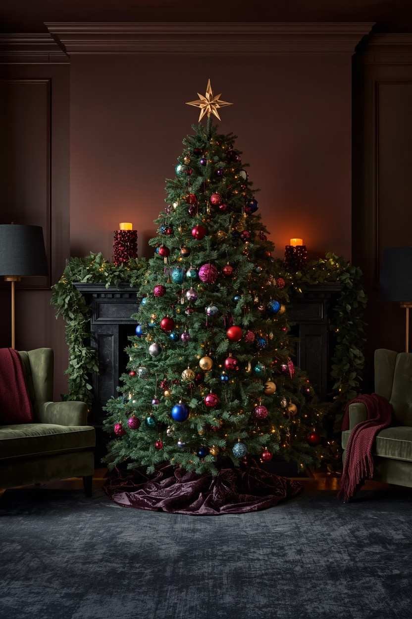
Emerald, sapphire, amethyst, ruby – jewel tones just hit differently. Deep, saturated, layered colors like that turn a Christmas living room into something you actually want to stare at for a while.
Don’t stick to one jewel tone instead mix 2-3 for depth. Use one as the main color, then layer the others as accents. Like emerald tree, burgundy + gold ornaments, teal ribbon, velvet stockings – instantly richer and more alive.
| 💡 Quick Note: Jewel tones look best against warm-neutral walls and wood tones. If your living room already has a lot of white or grey, add some warm lighting (think amber-toned fairy lights or candles) to stop jewel tones from reading too cold. |
4. Teal and Copper – Unexpected but So Good
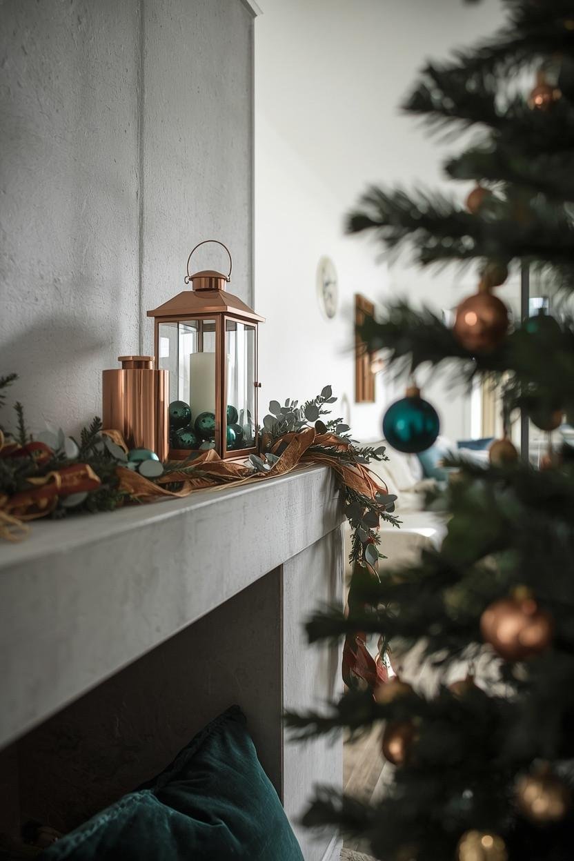
This one always catches people off guard – teal and copper at Christmas shouldn’t work but they absolutely do. The cool, moody teal next to that warm copper glow just makes the whole room feel festive and fresh, not traditional at all.
Teal is a fastest-growing Christmas color because it blends easily with most home styles instead of clashing. It works best when paired with warm metals like copper or bronze instead of gold or silver.
Things to Try:
| 🎄 Styling Element | How to Use It |
|---|---|
| Teal Glass Ornaments + Copper Lights | Mix on a natural tree for a rich, glowing contrast |
| Teal Velvet Tree Skirt + Warm Ribbon | Pair with copper or rust-toned ribbon for a cozy, luxe base |
| Copper Lanterns / Hurricane Vases | Group on hearths or side tables for warm ambient lighting |
| Teal & White Patterned Pillows | Add subtle festive color without feeling overly seasonal |
This palette also works beyond December, so your space doesn’t suddenly feel “out of season” in January – you’re not swapping out the whole vibe, just keeping it going naturally.
5. Warm Burgundy and Rust – Modern Earthy Christmas
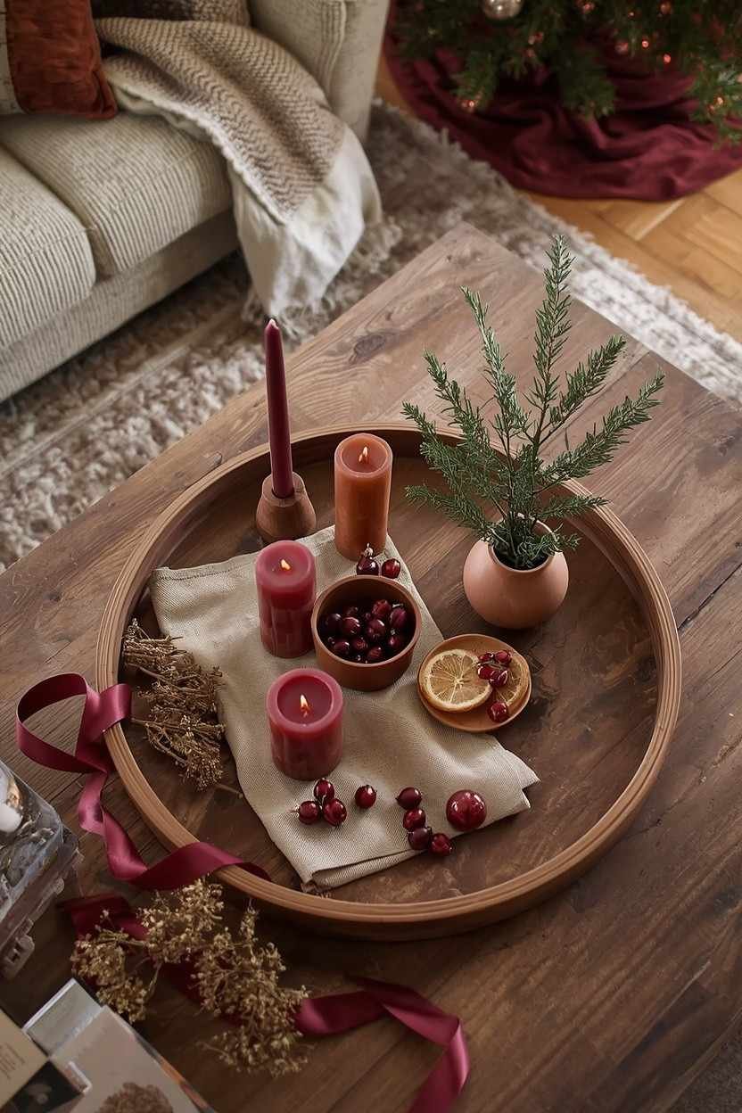
Love the cozy feel of a classic Christmas palette, but not into bright red? Burgundy and rust give you that same warm holiday vibe with a softer, more elevated touch.
Burgundy ribbon garlands, rust velvet pillows, terracotta candles and deep cherry ornaments instantly make a space feel rich especially with natural wood or a neutral sofa. Finish it off with dried orange slices in a wreath or garland.
📈 Trend Watch:
According to StoneGable’s 2025 holiday decor trends, warm earthy tones like copper, amber, rust and rich browns are becoming a go-to for Christmas decor specifically in living rooms that naturally transition from cozy fall styling into the holiday season.
6. Frosted Pastels – Winter Wonderland Without the White-Out
Not every Christmas look needs to be bold and dramatic. Soft pastels like icy mint, blush, pale lavender and powder blue create a cozy winter feel that still feels festive without relying on the usual red and green.
Picture This: a white-flocked tree with mint and lavender ornaments, silver snowflakes and warm white fairy lights. Pastel velvet stockings on the mantel and a lavender-cream wreath – calm, soft and unlike any other Christmas living room on the street.
| 🎨 Pastel Christmas Styling Tip | Why It Works |
|---|---|
| Stick to 3 Pastel Tones Max | Keeps the look cohesive instead of scattered |
| Use White or Silver Accents | Gives a clean, airy finish instead of heavy warmth |
| Add Rich Textures | Velvet, faux fur, and chunky knits prevent the look from feeling flat |
| Choose Warm or Cool White Lights | Keeps the palette soft and polished without clashing colors |
7. Black, White, and Gold – Modern Glam Christmas
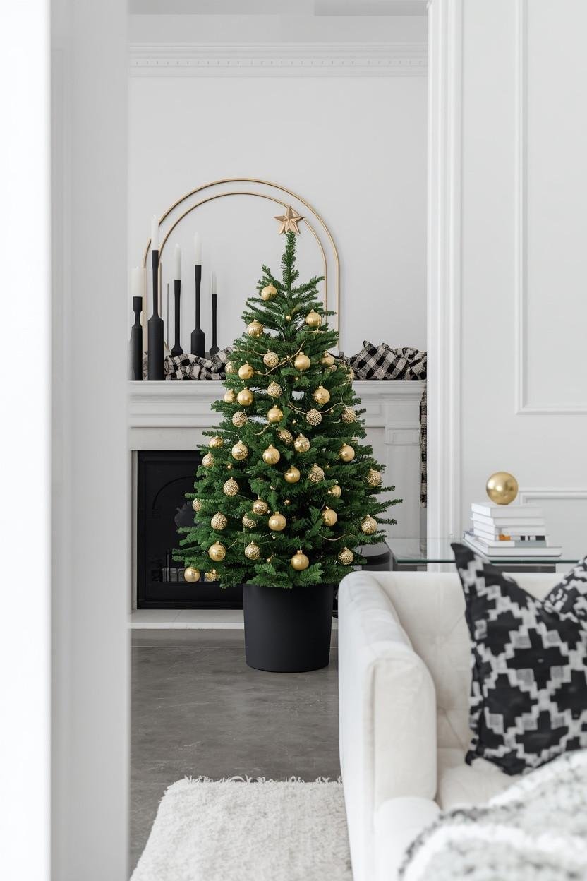
“Black at Christmas?” – yep. And yet black, white and gold has quietly become one of the most requested living room palettes for people who want something festive, but still modern, clean and true to their home style.
It doesn’t force your modern living room to act like a Victorian Christmas postcard.
Think black-and-white buffalo check throws, gold ornament clusters, white taper candles in matte black holders and a simple gold star topper. It is still full Christmas just in a way that actually fits a contemporary space instead of fighting it.
8. Moody Purple and Silver – Drama Done Right
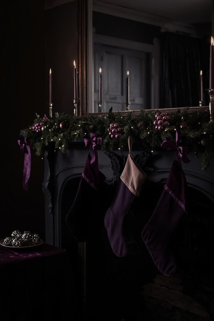
Deep purples like eggplant, plum and amethyst are still surprisingly underused in Christmas living room decor which is exactly why they stand out so well. Paired with silver, the look feels refreshingly unexpected.
Deep plum ornaments with silver tinsel and white fairy lights look really striking. Add a purple velvet runner, silver candles in different heights and amethyst ribbon on the mantel garland – it all comes together festive and a bit unique.
💡 Color Balance Tip:
Silver keeps the purple from feeling too dark or heavy. If you want a warmer effect, add a touch of rose gold instead of pure silver.
9. Vintage Pastels – Retro Christmas Charm
This palette is everywhere right now and for good reason. Vintage-inspired Christmas decor pulls from soft pinks, mint greens, pale blues and gentle purples which gives it that nostalgic, collected-over-time feel you just don’t get with new stuff.
Think rosy-cheeked Santas, frosted glass ornaments in dusty pink and seafoam, retro-patterned stockings and soft metallic accents. Mix in a few thrifted vintage pieces too – old ‘60s glass baubles often have the prettiest faded pastels.
The Result? Feels personal and way more unique than anything straight from a store shelf.
| 🎄 Vintage Pastel Christmas Tip | Why It Works |
|---|---|
| Thrift in Oct-Nov | Best time to find vintage ornaments and decor pieces |
| Choose Matte / Frosted Finishes | Gives a soft, authentic vintage feel (not modern shiny plastic) |
| Use Warm Amber Lights | Enhances nostalgia and creates a cozy glow |
| Add Dusty Red & White Accents | Old-fashioned candy cane tones that fit the pastel vintage palette |
10. Forest Green and Cream – Calm & Natural
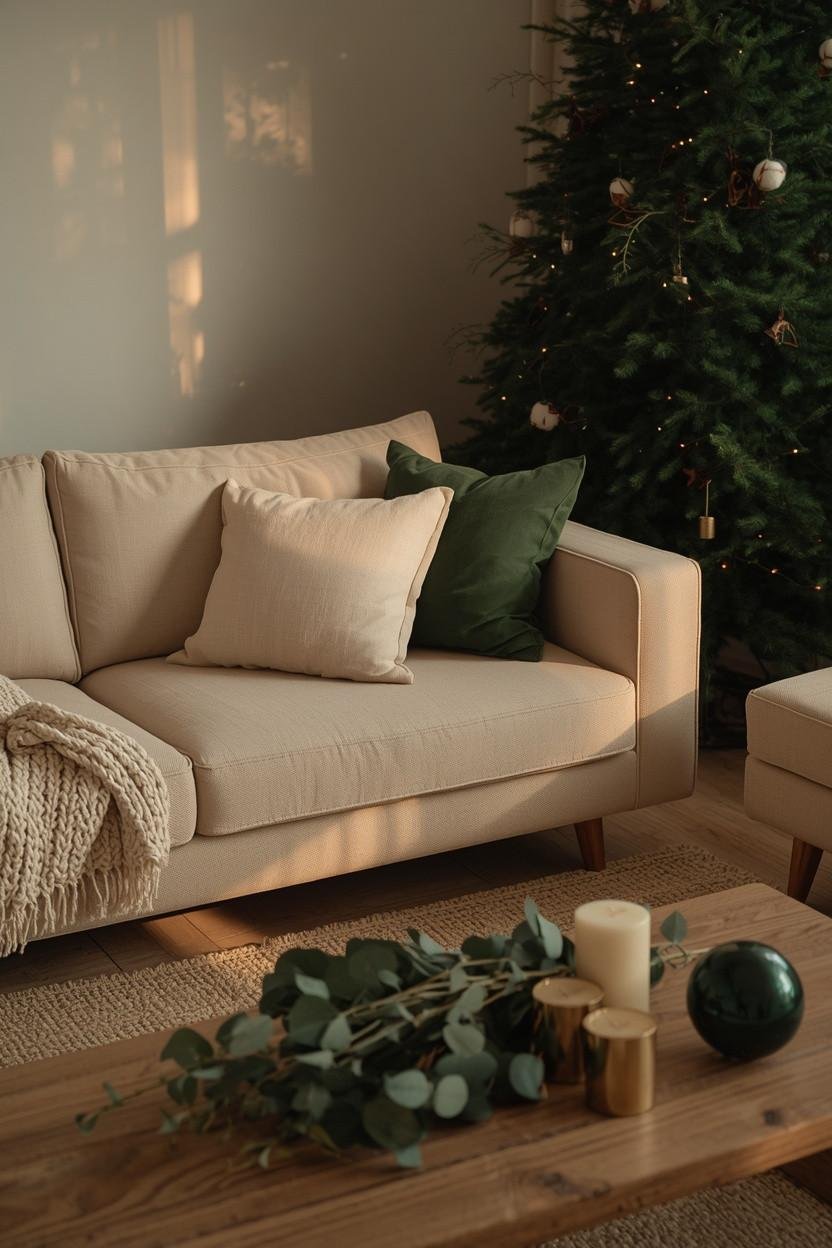
This is the kind of green that actually feels fresh – deep forest green paired with warm cream, natural linen and aged brass. It gives a subtle Christmas vibe without relying on red and it works especially well in living rooms that already lean into earthy, organic materials.
Layers of real or faux greenery (eucalyptus, pine, olive branches), cream candles and natural wood accents make up most of this palette which means you’re probably not buying much you don’t already own or use elsewhere. Brass or antique gold trimmings keep it from looking too neutral.
🎯 Season-Proof Choice:
This palette also happens to look incredible for the full stretch of the holiday season into January. You’re not ending up with something that screams “December 25” on December 26.
11. Hot Pink and Red – Yes, Really
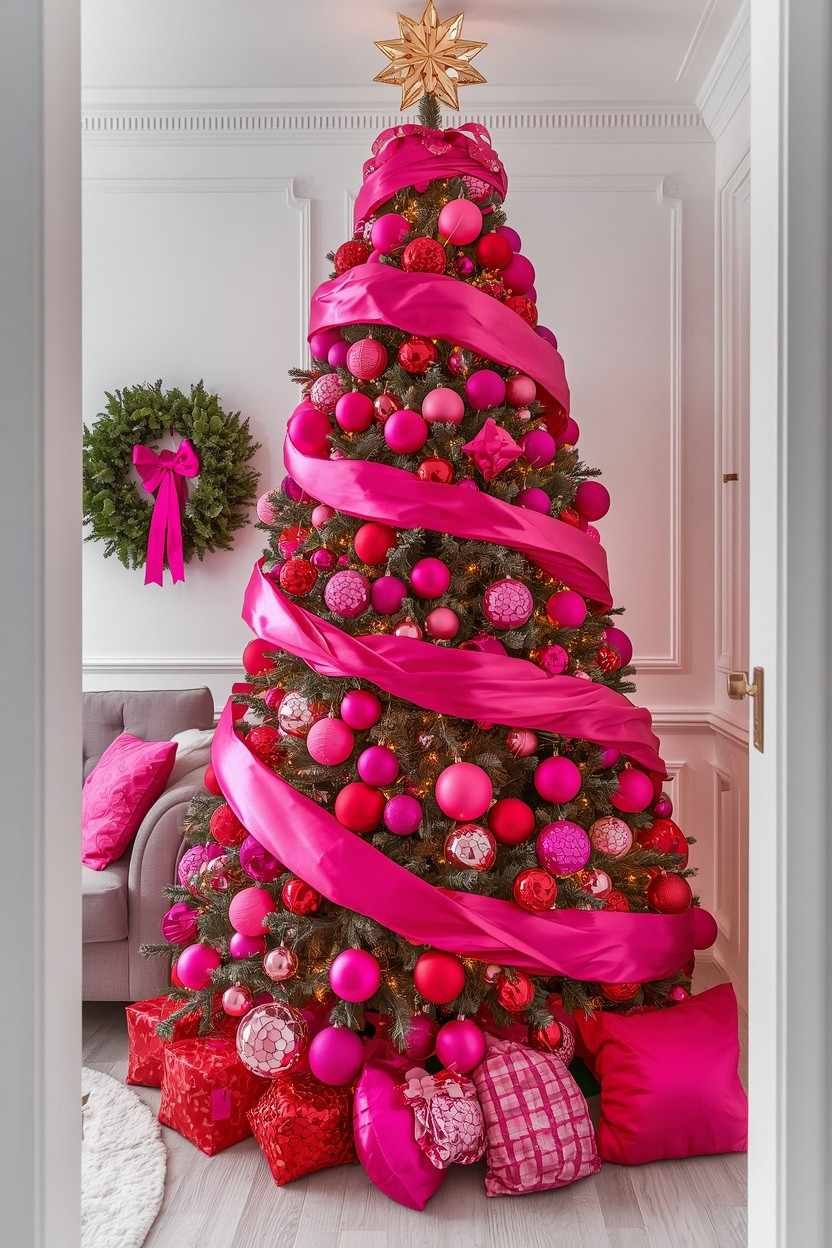
Hot pink and red together when done intentionally (with a nod to classic Christmas red), create one of the most energetic and joyful Christmas living rooms imaginable. It’s maximalist, fun and absolutely commits to the bit.
This really clicks with the SheCreatesColor.com readers – someone who loves bold color and doesn’t want their living room looking like every other house on the block.
Fuchsia and red ornaments on the tree, mixed pink and crimson throw pillows and a magenta ribbon on a greenery wreath. That is loud and full of energy in a way muted palettes just can’t match.
💡 Good to Know:
This works best against a neutral backdrop – white walls, a grey or beige sofa and light floors. The neutrals let the pinks and reds pop without the whole room feeling overwhelming.
12. Multicolor Done Right – Anti-Matchy Approach
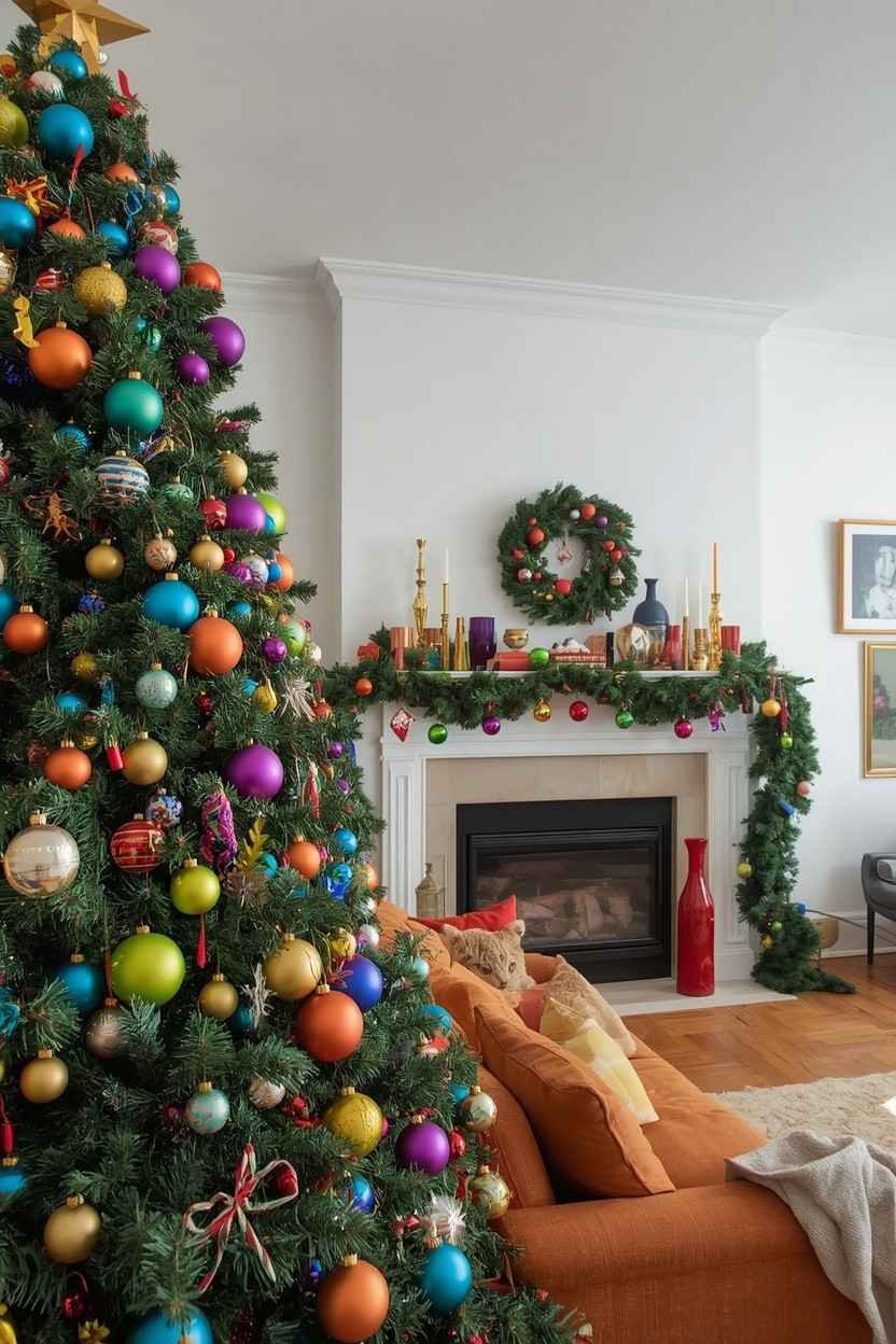
And then there is this: just pure color.
All of it – joyful, unapologetic, mix-and-match Christmas chaos that doesn’t ask for permission or pick a lane.
Done well, multicolor Christmas decor feels eclectic and personal like it is been collected and loved over the years instead of bought as a matching set.
The trick is to anchor it with one consistent element (all glass ornaments, a single finish or a shared metallic tone) and then let the colors do their thing freely around it.
Bright pink, teal, orange, lime green, cobalt, gold – all on one tree, one mantel, just pure color everywhere. It’s basically cranking the volume all the way up and in the right room, it totally works.
| 🎄 Multicolor Christmas Styling Tip | Why It Works |
|---|---|
| Unify Through Finish | Keep ornaments consistent (all matte, glass, or velvet) to avoid chaos |
| Stick to One Metallic | Use either gold or silver throughout to tie everything together |
| Add Greenery Generously | Acts as a natural neutral between bold colors |
| Limit Shapes & Sizes | Stick to 1-2 ornament shapes and vary only the colors for cohesion |
Quick Reference: All 12 Colorful Christmas Decor Palettes
| Palette | Vibe | Best For | Difficulty |
| Deep Blue & Gold | Luxe, moody | Neutral/modern rooms | Easy |
| Blush Pink & Champagne | Soft, romantic | Any room style | Easy |
| Jewel Tones | Bold, dramatic | Warm-toned rooms | Medium |
| Teal & Copper | Unexpected, cool | Contemporary spaces | Easy |
| Burgundy & Rust | Earthy, warm | Fall-to-Christmas rooms | Easy |
| Frosted Pastels | Dreamy, wintery | White/light rooms | Easy |
| Black, White & Gold | Modern, graphic | Minimal/Scandi rooms | Easy |
| Moody Purple & Silver | Dramatic, festive | Neutral backdrops | Medium |
| Vintage Pastels | Nostalgic, charming | Eclectic rooms | Easy |
| Forest Green & Cream | Natural, calm | Organic/earthy rooms | Easy |
| Hot Pink & Red | Bold, joyful | Colorful, fun rooms | Easy |
| Multicolor | Eclectic, vibrant | Any – go for it | Medium |
Final Thoughts
Red and green will always be Christmas because that is not going anywhere. But it is also not the only option – not even close.
You don’t need to redesign your whole living room for December. Start with one bold swap and then see how it feels. More often than not, it feels really good.
Now go pick the palette cause your living room has seen enough red and green. 🙂